This case is the foundational UIUX work of Shepherd Money. To modernize a traditional bank-app interface, I created an innovative design system that not only enhanced user experience but also streamlined development process.
Sep 2021 - Dec 2021
3 Developers
1 Product Manager
1 Jr Product Designer
Shepherd Money initiative launched in 2022 with a cross-functional team of designers and engineers. The designers established a foundational design system and core user flows, but after their contracts concluded, the engineers were left to manage ongoing feature and flow iterations without design oversight. This case focuses on realigning the product with user needs while rebuilding a scalable, engineer-friendly system.

The design system streamlined the development process, resulting in a 30-minute reduction in design/code creation time for a chart component, decreasing from 40 minutes to 10 minutes.

Before the design system, frequent last-minute UI fixes caused delays due to inconsistencies in colors, spacing, and components. After standardizing design patterns, these issues dropped by 50%.

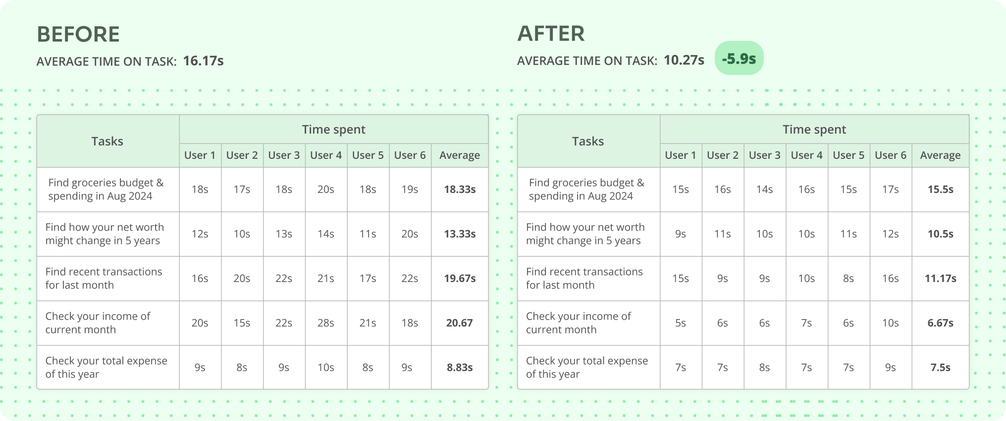
The design system facilitated a more efficient user experience, resulting in an approximately 5s reduction in average task completion time with almost the same user flow.
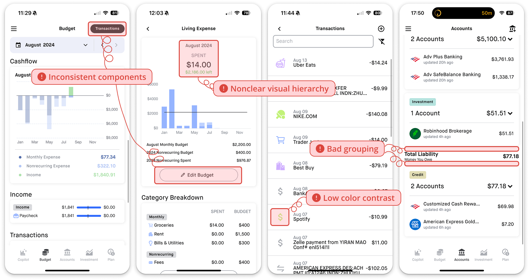
The old UI felt cluttered and disorganized, with inconsistent typography and spacing that made it hard for users to scan and absorb information. Poor contrast between icons and backgrounds further hurt usability, making key elements less accessible. These issues came from a lack of clear visual hierarchy and fundational UI/UX principles—like consistency, proximity, and contrast—leading to a frustrating and inefficient experience.
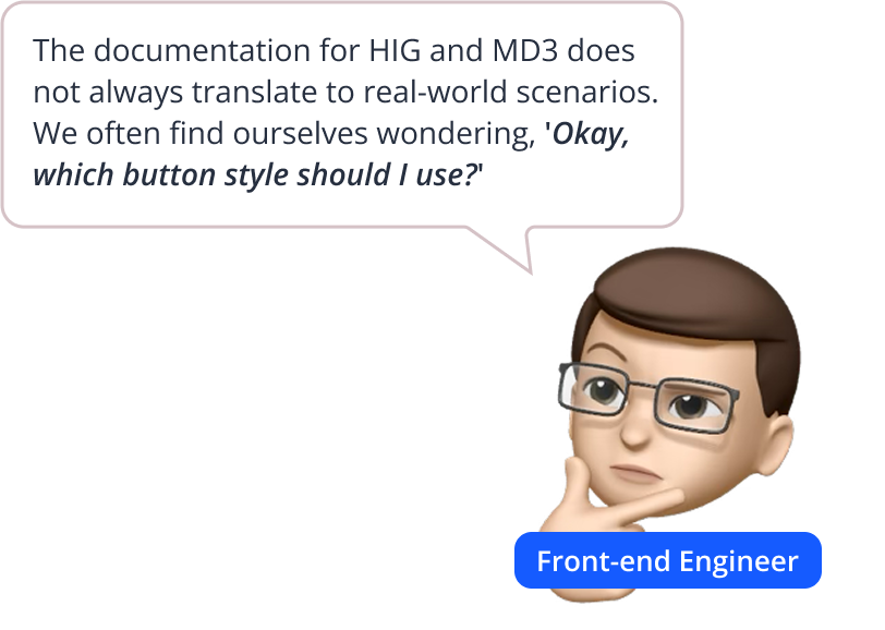
We explored two leading design systems—Google's Material Design 3 and Apple's Human Interface Guidelines—as foundation for our own. Our engineering team's prior experience with these systems, while valuable, revealed a need for a more tailored and intuitive approach.
—— Our goal was to learn from the best practices of these established systems and adapt them to our specific needs.


Material Design 3
We leveraged its robust toolkit, including the Theme Builder, for its customization potential for reflecting our brand. However, we consciously avoided its extensive component variations, opting for a streamlined library.
Human Interface Guidelines
It was instrumental in understanding native iOS component best practices, particularly for elements (date pickers, face ID...) We adapted these guidelines while considering their limitations of brand color customization and semi-transparent colors and blurs complexity.
After deeply researching MD3 & HIG and browsing many other trending design systems like Ant Design, Duolingo, IBM Design Language, we summarized 2 objectives:
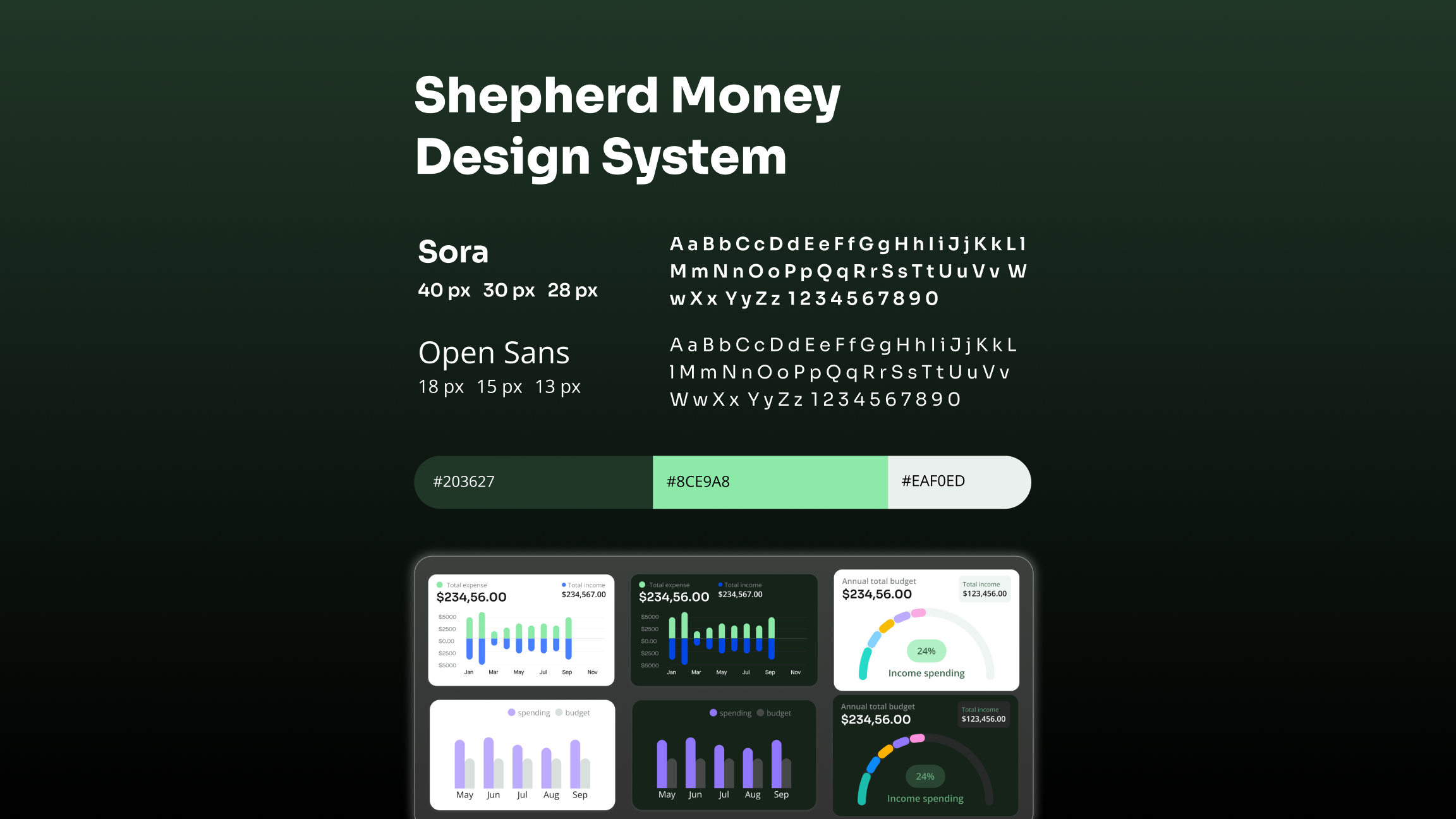
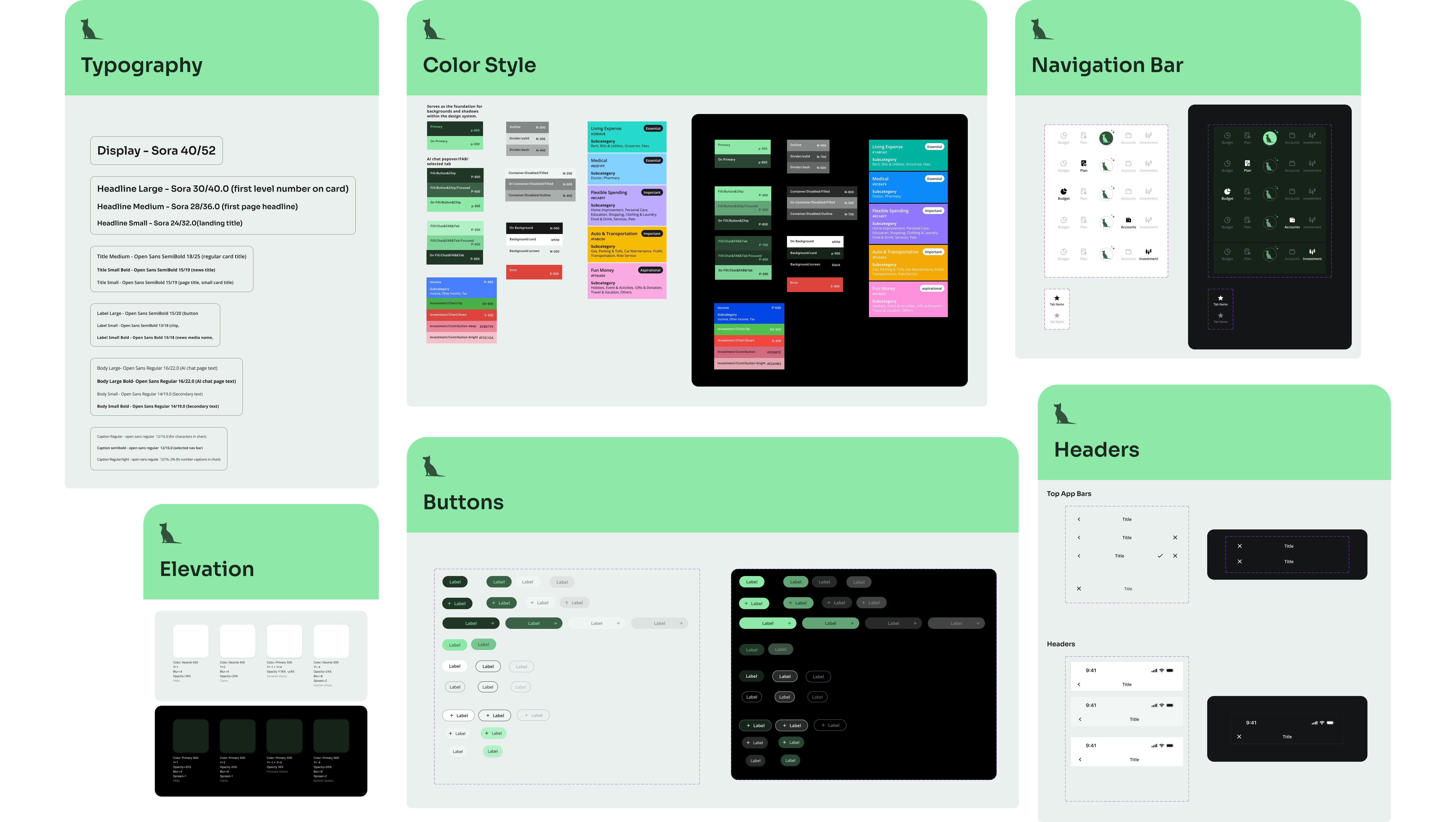
After our research, we defined the key focus areas for a design system tailored to our AI-integrated financial app, starting with foundational components — colors, typography, iconography, spacing — and devoting extra care to charts and Al insights for visualizing financial data.
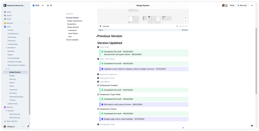
To ensure easy access to the most current information, I integrated an updated design system tracker directly into our team's documentation.
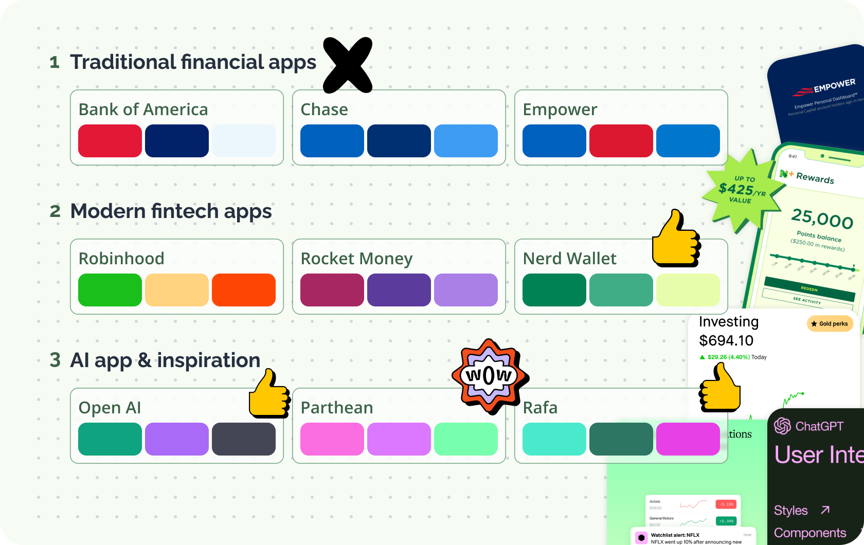
Shepherd Money initially used a dark blue (Sapphire) brand color, similar to traditional banking apps (Bank of America, Chase) which convey professionalism and trust. However, as an AI-powered consumer app, our goal isn’t just to present precise financial data but to deliver AI-driven insights in a more engaging way.
💬 Discussion between stakeholders and designers
1. While these dark blue and redconvey power and trust, we decided not to use them as we are positioning ourself in the AI-driven fintech space.
2. Robinhood: Bold and engaging, but its vibrant palette requires a dedicated graphic design team to maintain consistency. Rocket Money: Burgundy red lacks strong financial association. Nerd Wallet: Clean and consistent, with green symbolizing growth and wealth.
3. Rafa: Mint and green tones give a strong technological feel. Patheon: Shares the same challenges as Robinhood - requiring complex visual branding. OpenAI: A strong AI reference.
Based on this analysis and several experiments we chose dark green as our primary color, striking a balance between trust, innovation, and financial growth, while ensuring visual consistency without heavy graphic design overhead.
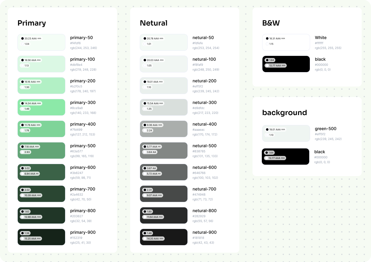
Tracking spending & budgeting is a core feature of our app - users frequently interact with multiple category colors. To ensure clarity and usability, I avoided primary colors and prioritized text contrast on category chips.
Initially, I explored lighter tones for a fresh look but found them too subtle -> so I opted for more vibrant colors. Since these colors occupy minimal space in the interface, maintaining consistency is not a challenge.
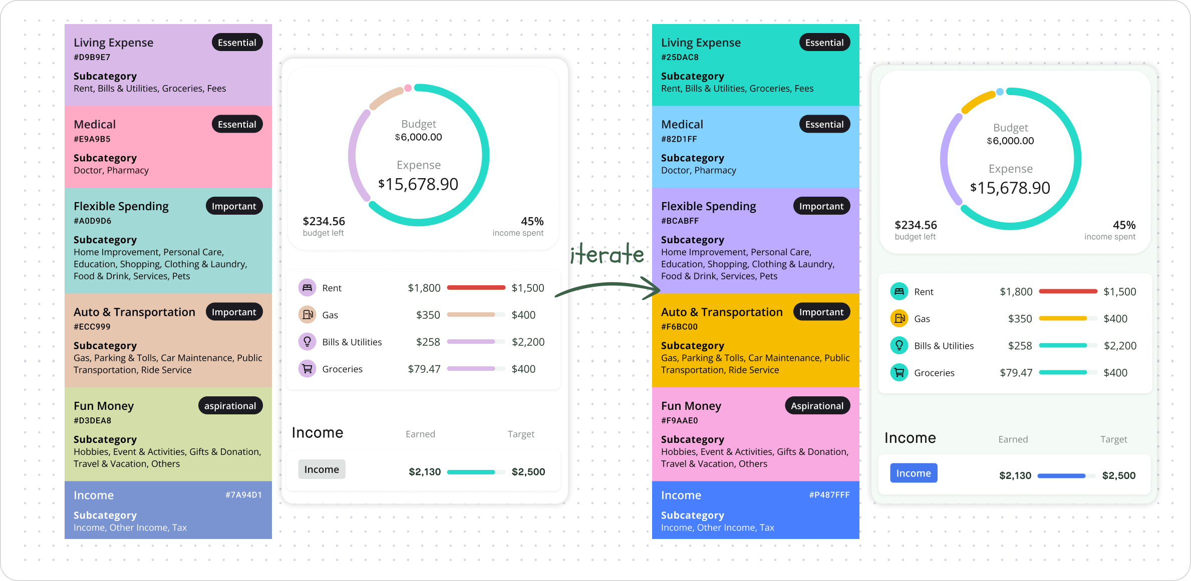
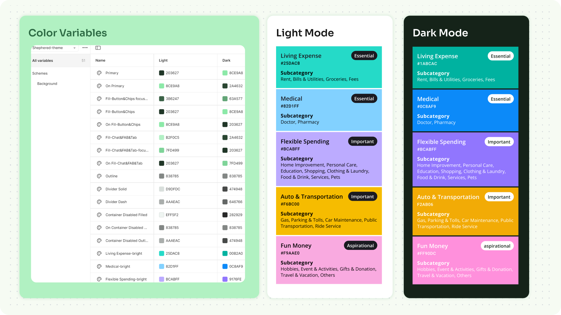
Dark mode improves readability in financial apps, especially for users checking data at night. Manually designing both light and dark modes can cause inconsistencies and extra work. Then I learned using Figma variables to streamline this process.
Figma Variables is a powerful feature that help me to manage both themes simultaneously, it can switch theme in seconds without manual duplication and ensure readability & consistency.
Charts play a crucial role in Shepherd Money, they transform complex data into clear, actionable insights. Since one-size-fits-all approach doesn’t work—users interact with data in different contexts, it requires adaptable visual presentations.
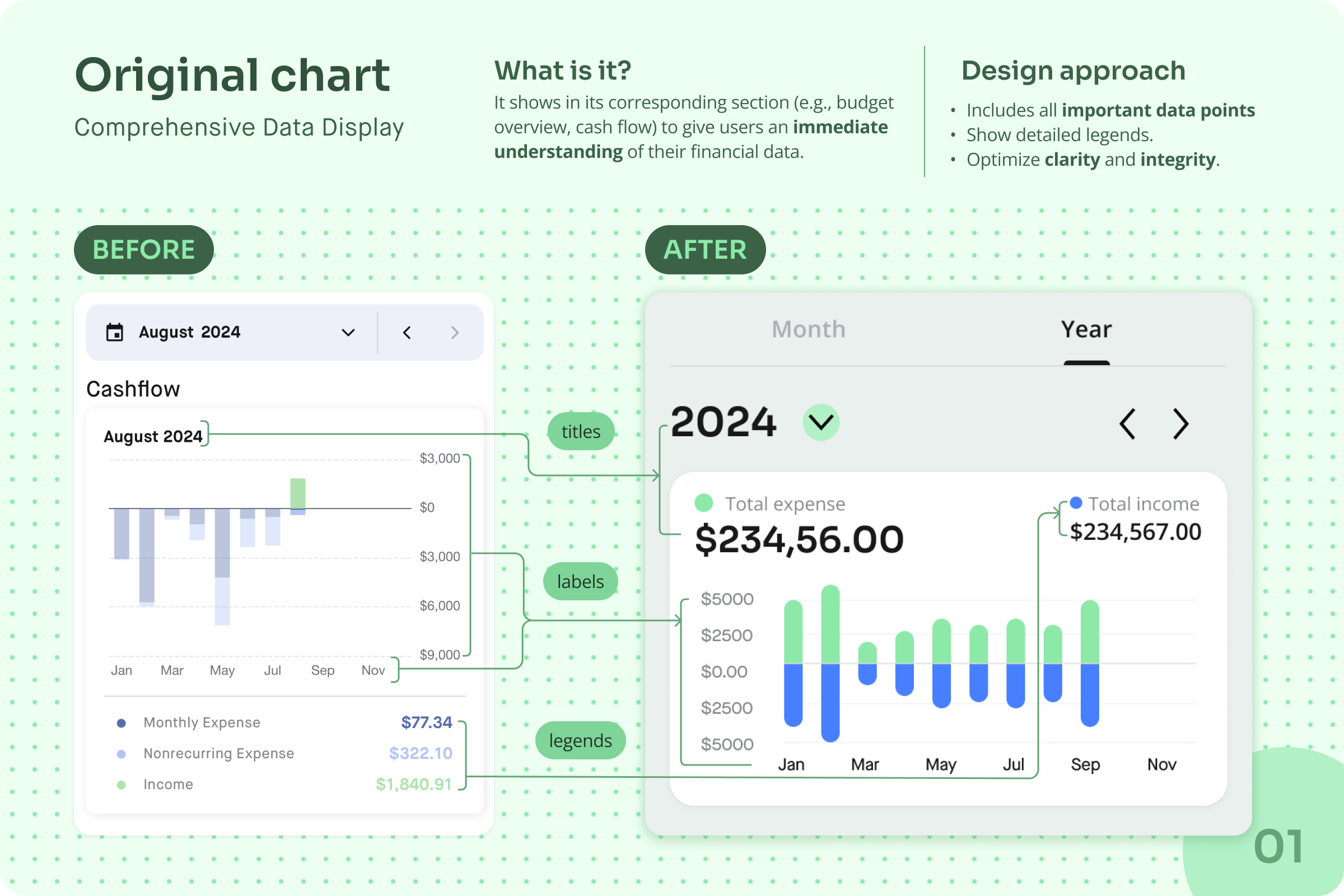
After rounds of user research and user flow iteration we identified the need for three main chart variations to fit most scenes. Here is an example of one chart variations.
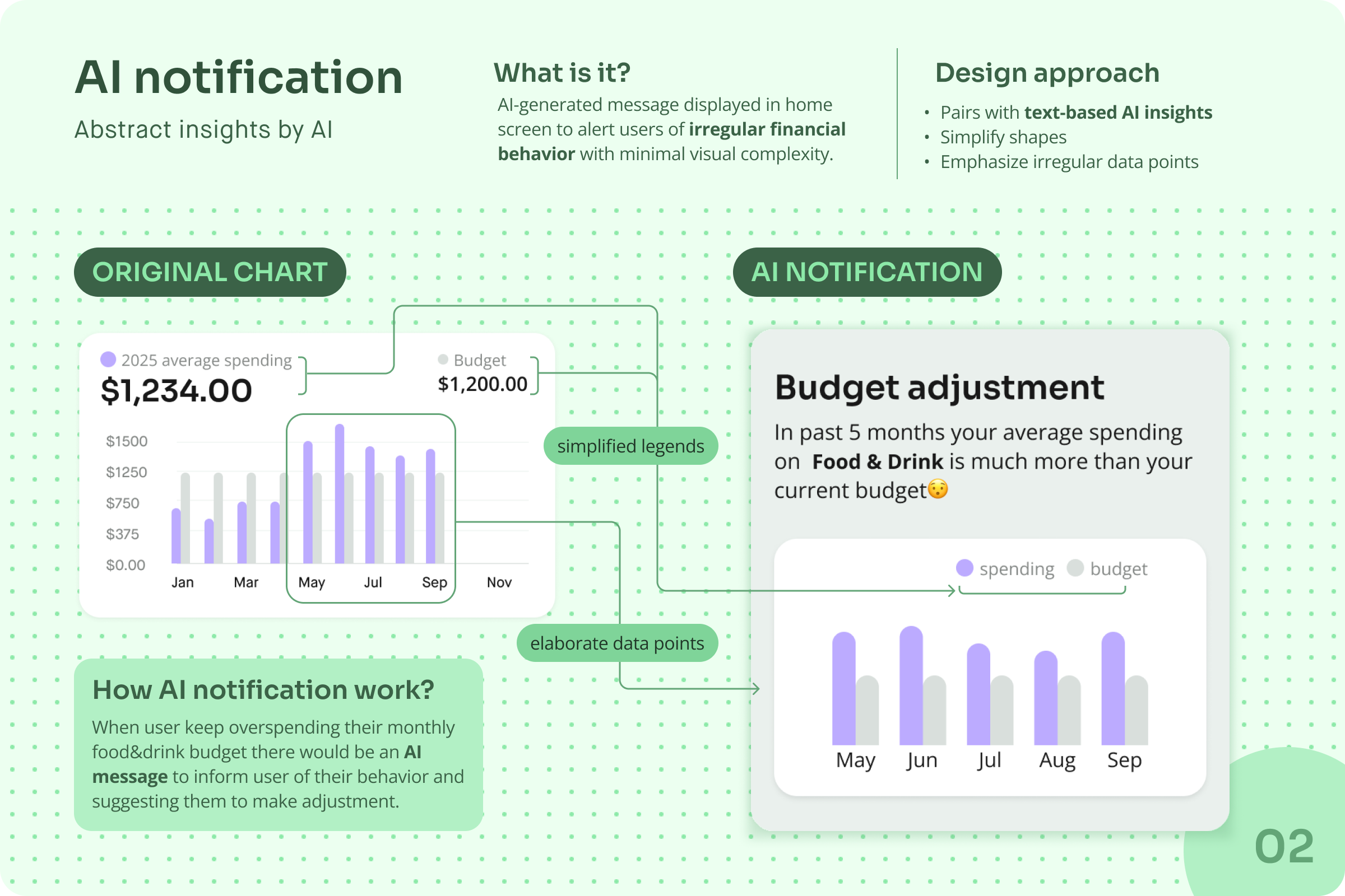


Extra variation: detaied AI advice
After developing the three main chart variations, we realized that AI notifications needed further clarification based on user feedback, as abstract visuals alone couldn't give enough information for user to make decision, so we created an extra format for detailed AI advice.
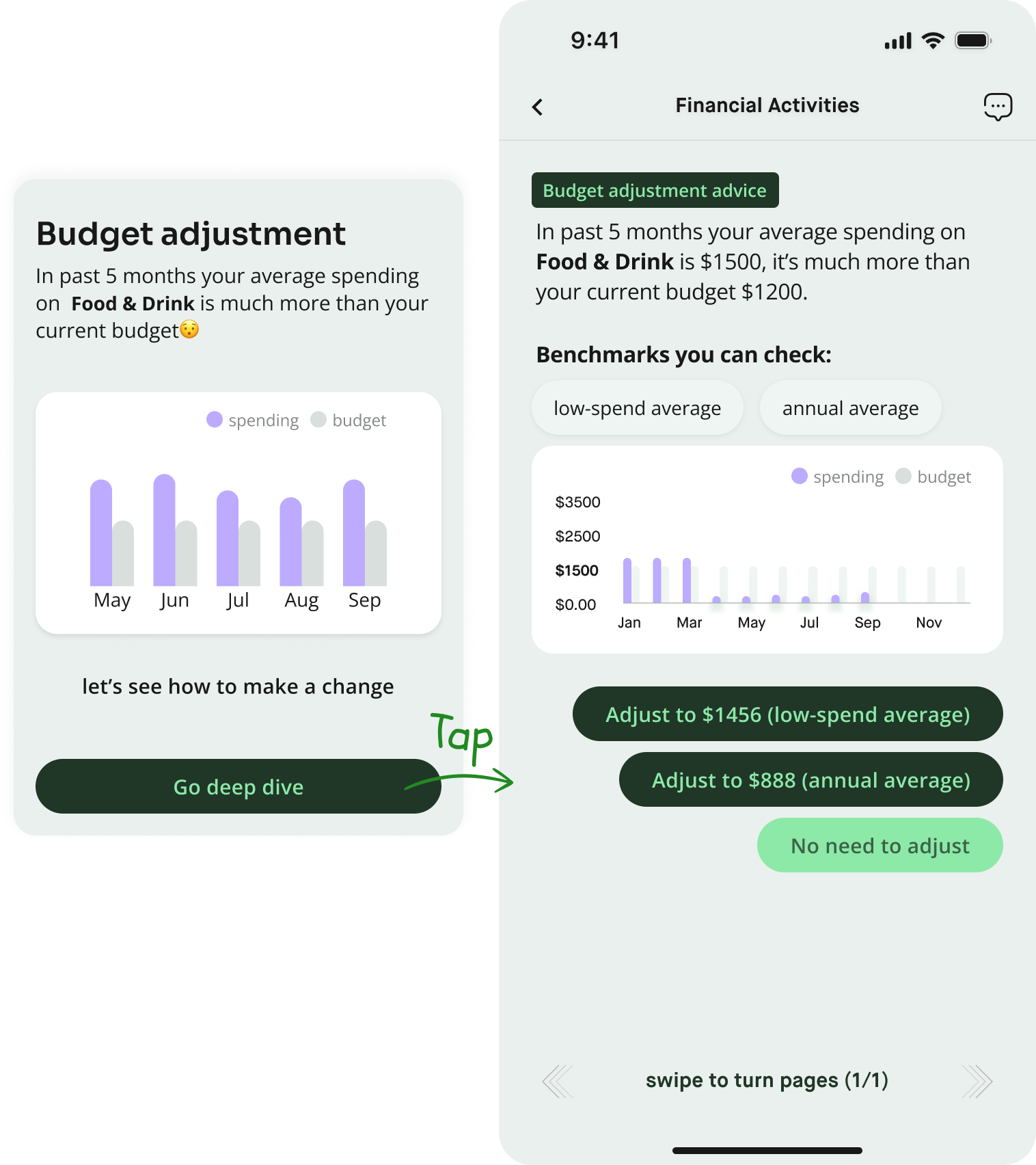
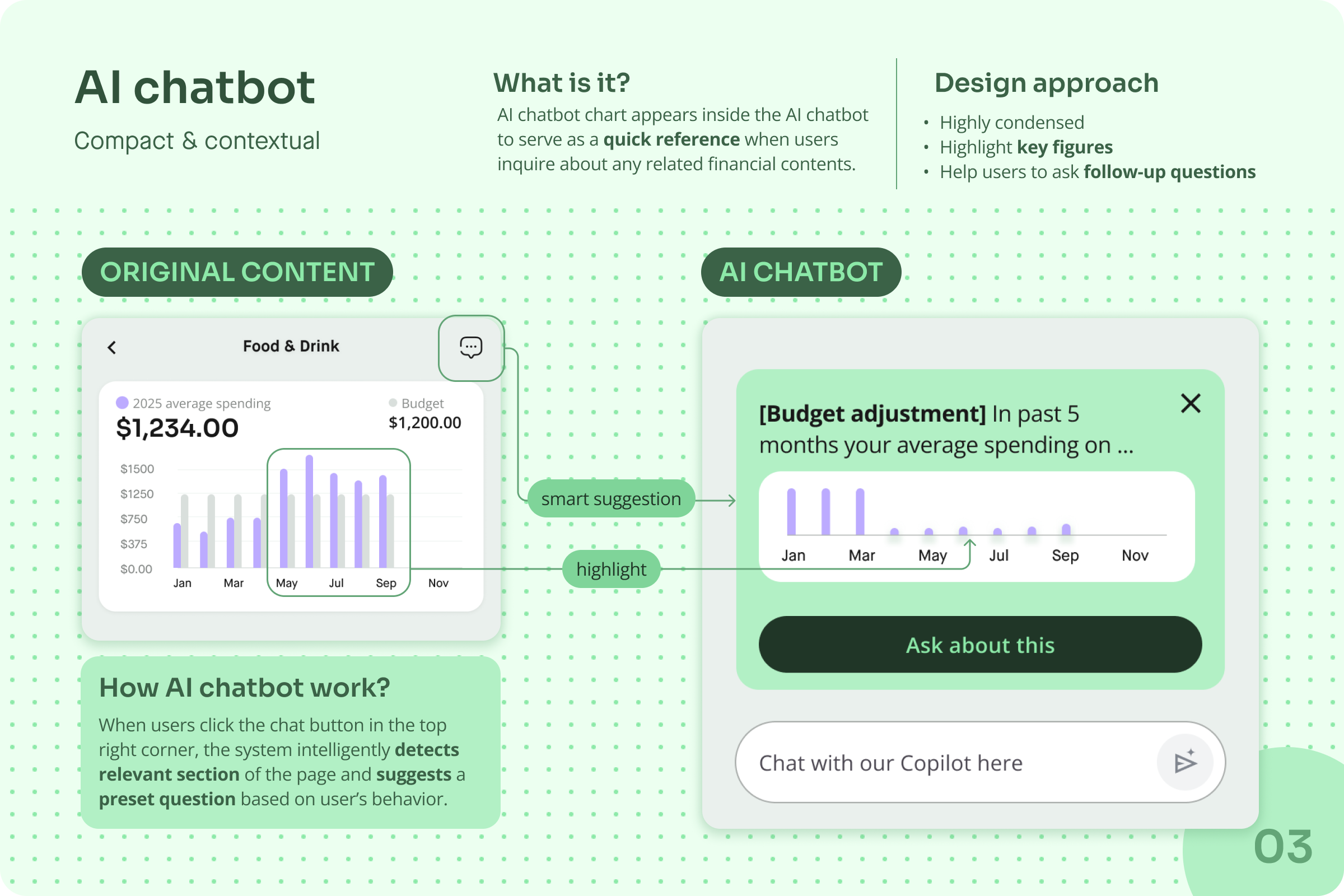
Finally, we introduced four distinct chart formats, each tailored to different types of AI-generated content, ensuring users receive the right level of information when they need it:

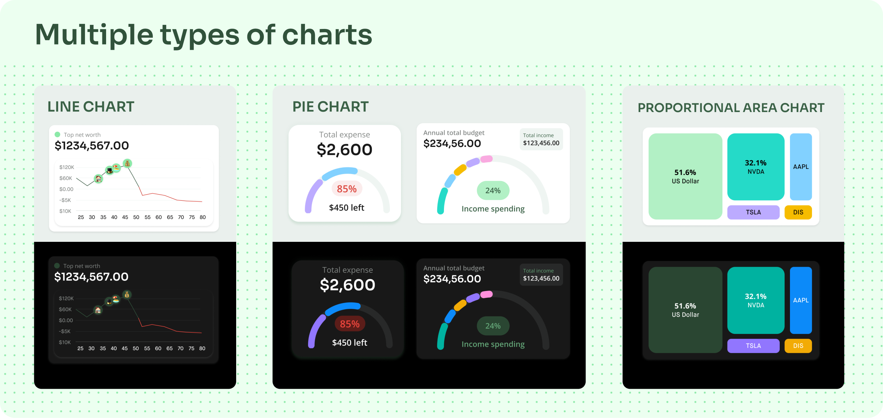

User-Centered adaptability: All four chart forms are crucial and adapted to diverse scenarios, ensuring comprehension and efficiency across different features.
Iterative refinement: We evolved from 3 to 4 formats based on user feedback, we listened to users about their concern and figured out a solution both effort friendly and meet user needs.

Pixel perfection: Though some charts are already implemented, they are still not yet pixel-perfect and require further polishment.
Rigorous design tokens: We prioritized rapid iteration over a structured design token system, which will be crucial for scalability in later stages.
We've done useability testings of the previous version with 6 users to test our 5 basic functions, now we're testing with same tasks that there is minimal change in user flow but visual is totally different.
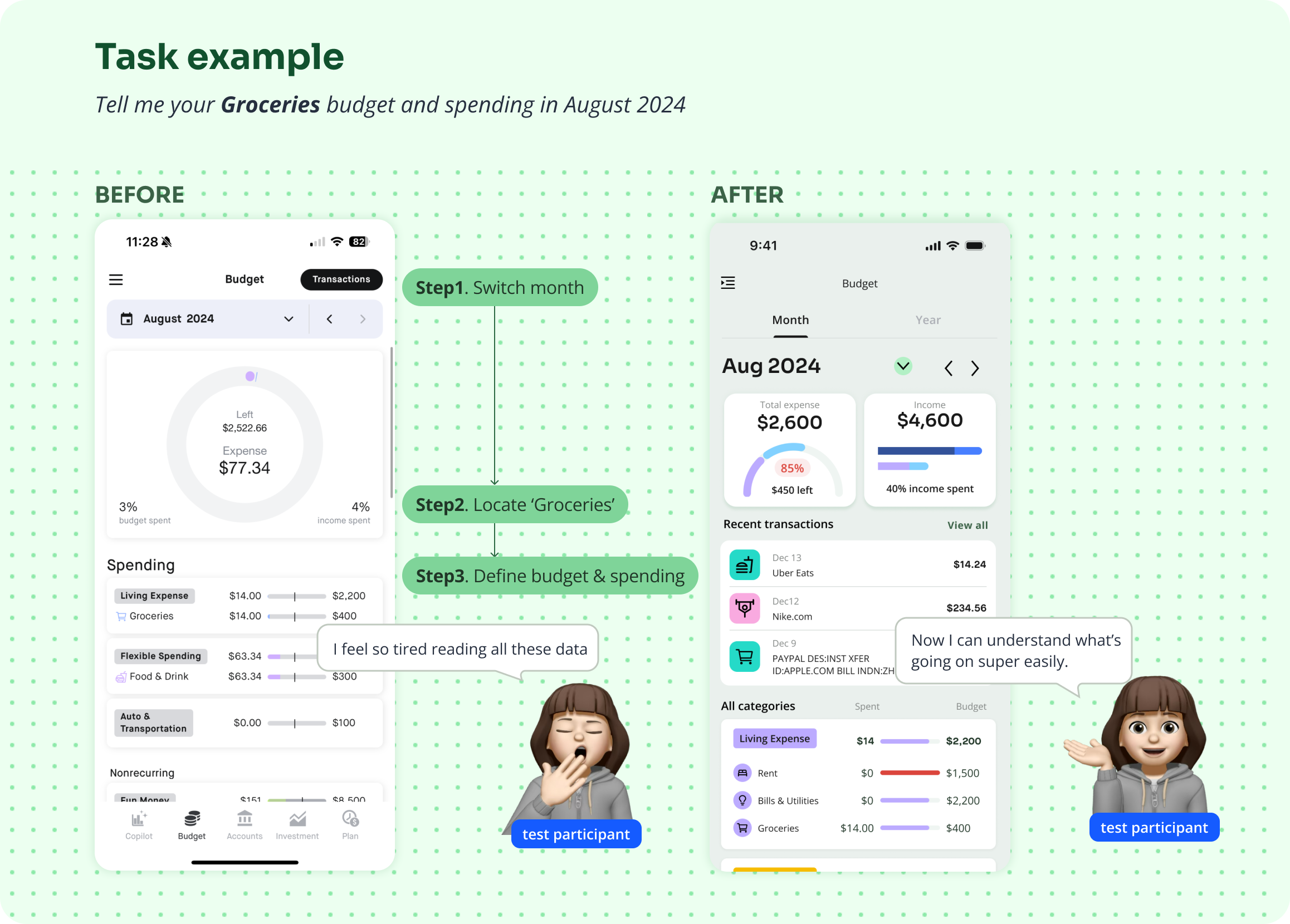
Although we acknowledge that certain flows can be further enhanced, the redesigned version with updated design system represents a significant achievement for the iteration.

